Tag Archives: pretend infrastructure

More ‘pretend infrastructure’ – Gudvanger Straße, Berlin

Dieser Artikel wurde auch auf Deutsch veröffentlicht.
This article has also been published on my German blog.

There’s a sign which is used on some streets around here, which looks like this:

Share nicely, everybody! (From Wikipedia)

I assumed this means something like “home zone” and it turns out that’s pretty much right.

It marks the start of a “verkehrsberuhigter Bereich” which translates as “traffic-calmed area”. It means:

  • Pedestrians may use full width of the street.
  • Children are allowed to play anywhere.
  • Vehicles must travel at walking pace.
  • Drivers must not hinder or endanger pedestrians. They must wait when necessary.
  • Pedestrians must not unnecessarily hinder drivers.

There are also some parking and loading restrictions, but the headline is: this should be a place for people who aren’t using a vehicle.

But like the last post about Berlin’s pretend infrastructure, this sign is used on motor vehicle through-routes, and as such is entirely useless.

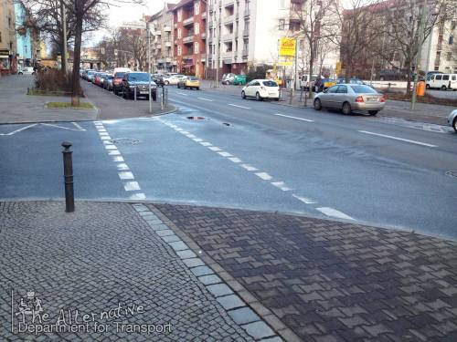
I’ve seen these all over Berlin. I’ve never seen children playing in them, nor have I seen people walking along them. They’ve all been rat-runs.

Here’s the nearest one to where I live. On one side there’s a park, and on the other there’s a school:

Gudvanger Strasse in Berlin. Where the traffic-calmed area is, the road narrows and is raised up.

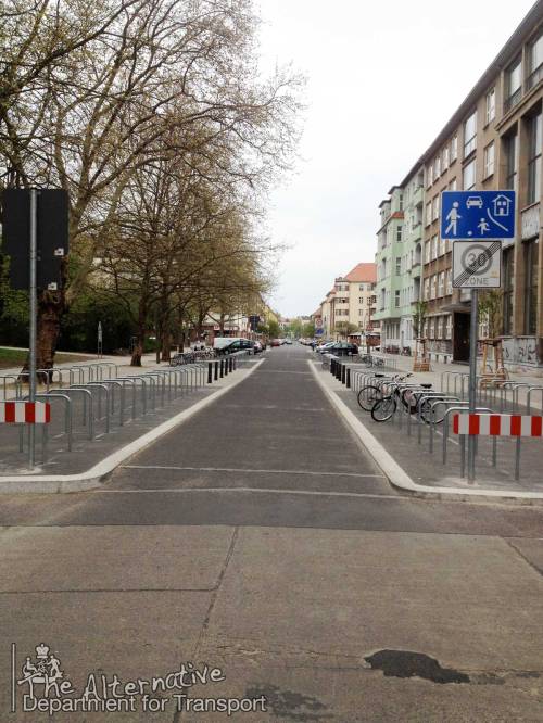
The authorities clearly saw there was a problem here, as the current situation is an improvement over how it was in 2008. There are lots of bike stands, and the road has been narrowed which must discourage some drivers from using it, as they’ll have to wait for any oncoming traffic to clear, but it’s clearly not good enough:


The traffic calming treatment is so weak I can’t understand it. Why isn’t this section of the road closed entirely, and permanently? There’s no need for it to be a through-route at all, as the roads either side of it are also two-way through routes.

Even the local children can see the problem, as they’ve written messages such as “walking speed”, “playing allowed” and “3 – 7 km/h” on the road, in chalk:

The local kids can see what the engineers can’t.

I find this really sad.

The children are telling us that there’s a problem here, they recognise that there’s a traffic problem – but the city isn’t listening, so the kids are trying their best to solve it the only way they know how.

Then their chalk pleas are worn away by car tyres.

Luckily, some of the local people are listening, and have set up a weekly “play street” event every Tuesday from the 26th of May. Let’s hope it leads to permanent change.

(Update: Sadly, one local resident didn’t like the one-day-a-week play street. They took the project to court, and the judge agreed. Berlin’s streets are just for the burning of oil, it seems. Read a Google-translated article about it here.)

Perhaps they were inspired by what the children of Amsterdam did in 1972?


“You can keep asking, but if the city doesn’t act you have to do things yourself.”


5 Comments

Filed under Uncategorized

Visual Priority

I wrote this post about how the visible physical appearance of a junction should emphasise the legal priority that exists (unlike in the UK where design often contradicts priority). But while clear visual priority is an essential part of junction design, it’s merely a way of emphasising the legal layout. It is not enough to create a safe junction on its own, as David Hembrow explains here.

I’d like to discuss something which is often done wrong: priority.

I’m not talking about the legal sense, but the visual sense. We need to change the way we think about minor junctions.

You see, you can have all the laws and paint you want, but if a junction looks like the cars have priority, then drivers will take advantage.

Here’s an example, on Cable Street in London:

A junction on the Cable Street cycleway in London. The cycleway has priority, but everything suggests otherwise: the kerb and yellow lines cut across the cycleway, creating confusion.

This is really poor. (Photo: Google Maps)

Let’s ignore the many, many failings of this poor-quality cycleway (we’d be here all day) and concentrate on how the junction is arranged.

The cycleway has priority here, but so many things suggest otherwise. The kerb-line, for example, curves around and across the cycleway. The yellow lines do the same, creating vagueness in priority.

Note how there’s no kerb running along the edge of the cycleway as it crosses the junction, either – the carriageway is constant, while the cycleway is interrupted. This is a confusing mess.

Considering that many, many more people will walk across this junction than drive across it, it’s crazy that the footway isn’t also continuous.

These conflicting signals are often designed in by whoever draws up these plans. Perhaps the belief is that people will follow the rules like robots, ignoring things like kerb lines and parking restriction markings. But people don’t work like that, and this junction is unclear and dangerous as a result.

Further along the same road, a different junction is much better. Yes, it is still flawed, but the priority is much clearer:

A different junction on Cable Street, this time the cycleway is unbroken by kerbs or painted lines, and priority is clear.

Note the unbroken surface of the cycleway. (Photo: Google Maps)

Note how the surface of the cycleway is unbroken by kerbs or painted lines. (This junction would be much better with a continuous footway too.)

Here’s a poor example from Berlin:

A junction in Berlin where bikes have priority, but there's only two broken white lines on the tarmac to suggest so.

Technically, bikes have priority here, but I really wouldn’t trust that paint. The cycleway simply ceases to exist across the junction. (See it on Google Maps)

People cycling along this road have priority at this junction, but does it really look like they do? The asphalt surface of the carriageway is unbroken, the sweeping kerb (designed for fast turns by car) cuts across the cycleway, and the footway and cycleway both drop down to carriageway level.

There’s no inconvenience at all for people in cars. There’s nothing but two fading, broken white lines to suggest to drivers that they should give way. Can those lines even be seen in wet weather? What about when it’s dark?

This isn’t sustainable safety. It’s paying lip service to cycling and walking, and it’s the reason so many cycle campaigners believe cycleways to be dangerous at junctions.

They’re right – badly-designed infrastructure can be dangerous – but that’s not an inherent flaw with cycleways, it’s simply bad design. Well-designed cycleways are proven to be safe.

The junction above could – and should – look like this:

A cycleway and footway continue, unbroken, with clear priority across a minor junction

This is clear. There’s no mistaking who has priority here. (See it on Google Maps)

This is real cycle infrastructure, and real walking infrastructure – genuine, proven to be safe, tried-and-tested design, quite unlike the type of tokenistic rubbish we’re used to getting.

Here, the whole area doesn’t look like a road, it looks like footway, with a cycleway running through it. It’s clear that this isn’t the domain of motor vehicles. Nobody is “on the road” when cycling or walking through here – quite the opposite, it’s motor vehicles that are guests “on the path”.

The whole junction area is raised up to footway level (rather than people on bikes and on foot having to drop down to carriageway level) and motor vehicles must mount a ramp to enter the junction.

This ramp, plus sharp corners, slows cars right down. It also provides better visibility between drivers and those whose path the drivers are crossing – nobody needs to look back over their shoulder. It works in all weather, 24 hours a day.

At the risk of pushing the point too much, here’s another example:

A junction in Berlin where the cycleway has priority. The cycleway continues across the junction with priority, but it is still broken by a sweeping kerb line and change in surface.

Better, but still not right.

This is better than some of the other examples, but still flawed. The kerb line cuts across the cycleway, so the surface is broken. The surface of the cycleway is different as it crosses the junction. The corner radius is too large. The footway should also have priority across the side-road.

Here’s what it looks like from a driver’s point of view:

The junction shown previously, but from the view of a driver exiting the side road.

Not as clear as it could be.

It’s better than the paint-only examples, but the kerb still guides your eye around the corner. It’s good that the surface is different across the junction, but it still looks like the road has priority.

It could be much clearer, like this:

The view of a minor road junction, from the minor road. The footpath and cyclepath both sever the minor road's connection to the main road, and therefore it's clear that vehicles leaving the minor road do not have priority.

Much clearer.

To a driver leaving the minor road, it’s clear that they do not have priority here, that the road is severed by the footway and cycleway. People driving have to drive up a ramp and over the cycleway and footway in order to pass through this area the main road.

Anyway, I hope I’ve made the point. Failure to make priority clear and obvious is a design flaw which I see all the time, both in Berlin and back in the UK. To create truly inviting conditions for walking and cycling, highways designers must change the way they think about how junctions should look, and make a positive decision to make walking and cycling a clear visual priority.

25 Comments

Filed under Uncategorized

Pretend infrastructure

Dieser Artikel wurde auch auf Deutsch veröffentlicht.
This article has also been published on my German blog.

Bicycle streets! Don’t you just love them? Put up a few signs, a bit of paint, and voilà – instant Groningen.

Except it doesn’t work like that at all, though not everyone has figured that out yet.

For a bicycle street to work, it needs to have very, very low levels of motor traffic. It needs to form no useful through route for motor vehicles. Bikes needs to greatly outnumber cars and vans.

In Berlin, the highly-paid experts responsible for the roads think that signs and paint are enough to create a great cycle network. Just put up signs to tell drivers that a road is a bicycle street – or a home zone, or no entry – and they’ll behave differently, right? They’ll stop using that street as a rat-run, no?

Here’s Choriner Straße in Prenzlauer Berg:

Funny, the signs and paint don’t seem to be working.

Does it look like bicycles dominate there? Does that look suitable for young children? (And don’t be fooled by the low speeds, drivers are going slow because a double-parked car has narrowed the carriageway just off-camera to the left.)

This is pretend infrastructure – something which makes it look like the authorities are considering cycling, while they’re actually doing nothing. Other modes of transport don’t have this (with the possible exception of walking). There’s no airports without runways, or motorways with grazing sheep designed-in.

It’s not just Berlin that does this. When I lived in London, Lambeth Council painted bike symbols on Hercules Road to try and pretend it wasn’t an awful rat-run. That particular street is soon to be part of London’s forthcoming network patchwork of Quietways, so the green blobs of paint which taxis speed over will instead be purple blobs of paint which taxis speed over – more pretend infrastructure.

A nasty pinch-point on the rat run that is Hercules Road

A nasty pinch-point on the rat run that is Hercules Road


Here’s another bit of pretend infra, a moment’s walk away from the first video, at the junction with Oderberger Straße (look at it on a map and you’ll see it’s clearly a rat-run to cut the corner of Eberswalder Straße and Schönhauser Allee – no traffic lights, either).

This junction is signposted “no vehicles, except bikes and emergency vehicles” yet there’s nothing at all to stop anyone driving through here. So what happens?

More pretend infra. There’s even a “no through route” sign at the end of the street, but the local drivers all know this is nonsense!

The most profitable form of pretend infrastructure at the moment is shared space. If you’ve strolled along London’s famous Exhibition Road recently, you’ll be aware of the magnitude of bullshit at work here.

Lots has been written about the failure of Exhibition Road and other examples of shared space so I won’t go into detail here, but unfortunately the on-trend placemaking street architects’ marketing teams are still busy selling snake-oil, as can be seen here on Hackney’s lovely new Leonard Circus, where white van drivers share safely with anyone lucky enough not to be in the way:

Would you want your loved ones wandering around there when he speeds through this pretend infrastructure again, or would you prefer some tried-and-tested, proven-to-work sustainable safety?


(If you have any examples of pretend infrastructure, please leave a comment!)

14 Comments

Filed under Uncategorized